On Tuesday, March 3, the United States Mint unveiled design candidates for its planned 2017 American Liberty High Relief Gold Coin and Silver Medal.
The 24-karat gold piece extends the high-relief $100 series, with the first issue in 2015 capturing sales of more than 49,000. Designs on that coin will also appear later this year on two silver medals from two different Mint facilities.
Looking ahead, the themes for the planned 2017 high-relief gold coin and silver medal match those of the 2015 release. The proposed designs shows that their obverse or heads sides will feature a modern rendition of Liberty while their reverse or tails sides will depict an American eagle. The candidates are now being reviewed with an announcement on the final selections expected later this year.
U.S. Mint-provided images and narratives of the design candidates follow. They are presented in both their gold coin and silver medal versions.
Design Candidates for Obverses
Required inscriptions for the gold coin include "Liberty," "In God We Trust," "1792," and "2017." The companion silver medal will have the dates "1792" and "2017," with the optional inscription "Liberty."
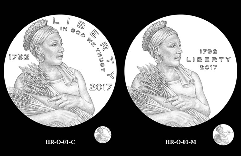
HR-O-01 depicts a contemporary Lady Liberty holding a bundle of wheat in her right arm while preparing to offer a portion with her left hand. The artist incorporated the wheat bundles as symbols of the wealth and charity of America’s prosperous society.
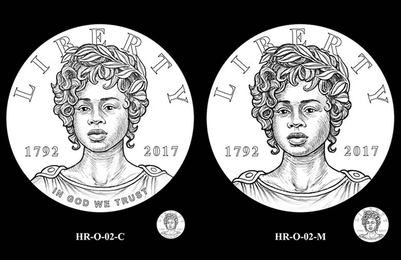
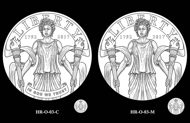
HR-O-02 shows a close-up portrait of Liberty, while HR-O-03 reveals her standing as she holds a torch in each hand, enveloped in a flowing banner.
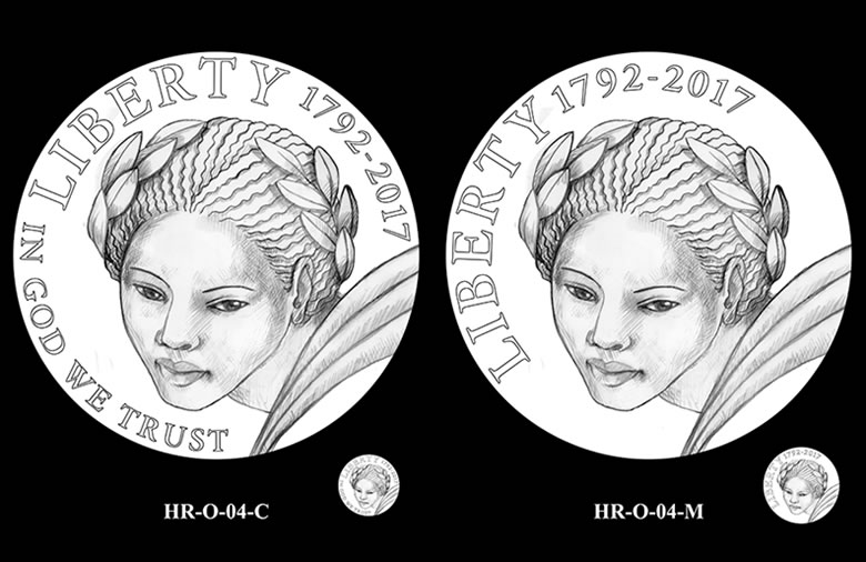
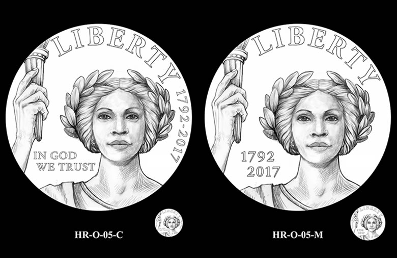
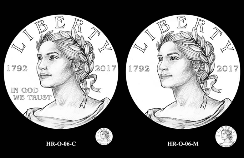
HR-O-04 through HR-O-06 depict close-up views of Liberty. In HR-O-05, her hand holds a torch.
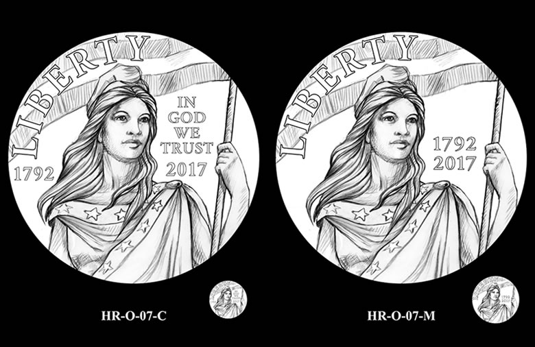
HR-O-07 finds Liberty wearing a Phrygian cap and a gown adorned with stars. She holds the American flag in her left hand.
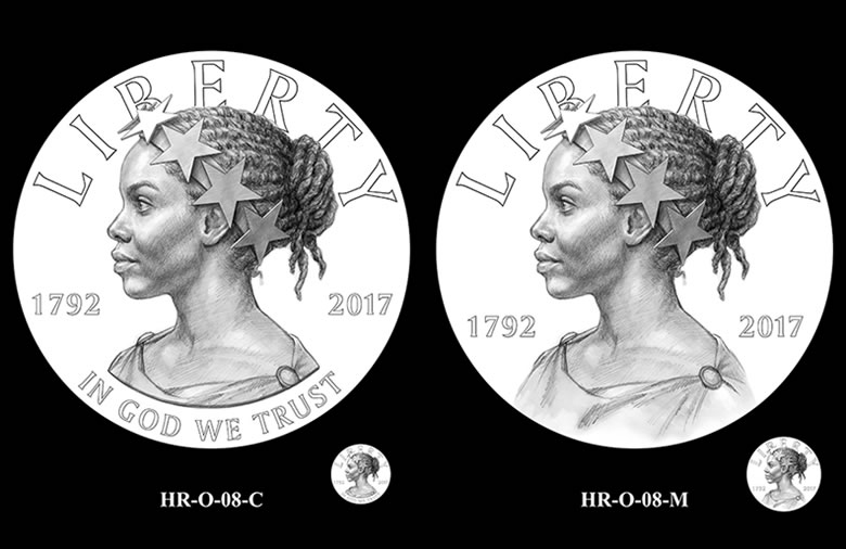
HR-O-08 features a profile of Liberty wearing a crown of stars, a nod to the Statue of Freedom atop the U. S. Capitol.
Update: Both the Commission of Fine Arts and the Citizens Coinage Advisory Committee recommended HR-O-08-C/M for the coin and medal obverses.
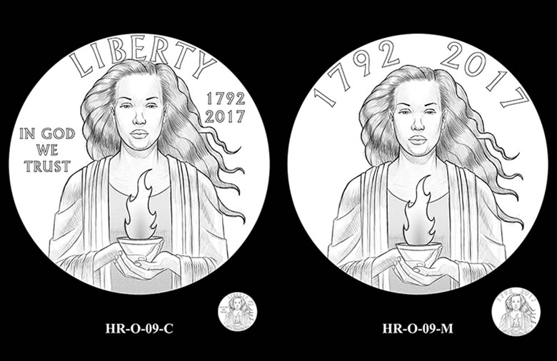
HR-O-09 depicts Liberty holding a flame in front of her.
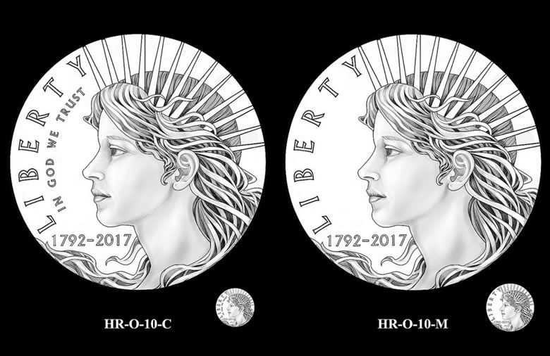
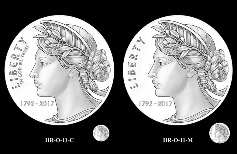
HR-O-10 and HR-O-11 show close-up images of Liberty in profile. In HR-O-10 she is crowned in rays, symbolic beacons of hope, while in HR-O-11 she wears a crown inspired by that of the Statue of Liberty.
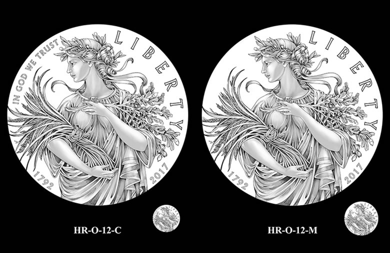
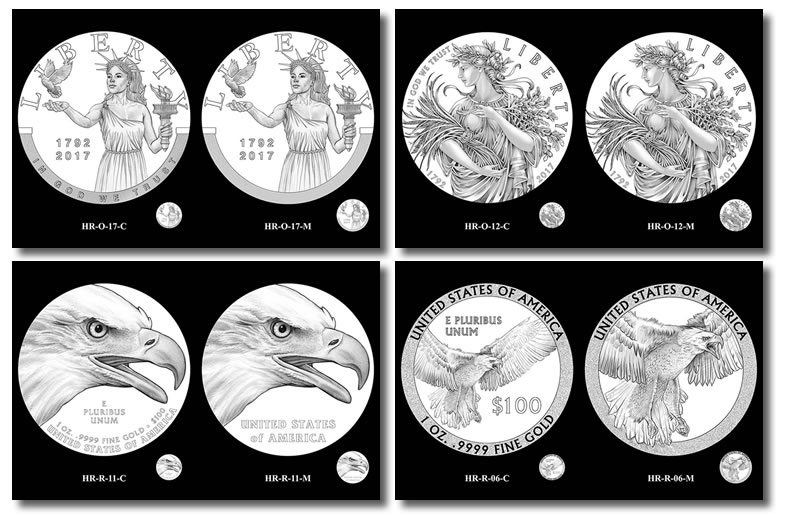
HR-O-12 features a standing Liberty. On her arm, she cradles a variety of grains, rice, wheat, oat and barley, representing diversity and abundant charity. Resting on her chest, her other hand is holding a branch of oak, symbolizing strength and integrity.
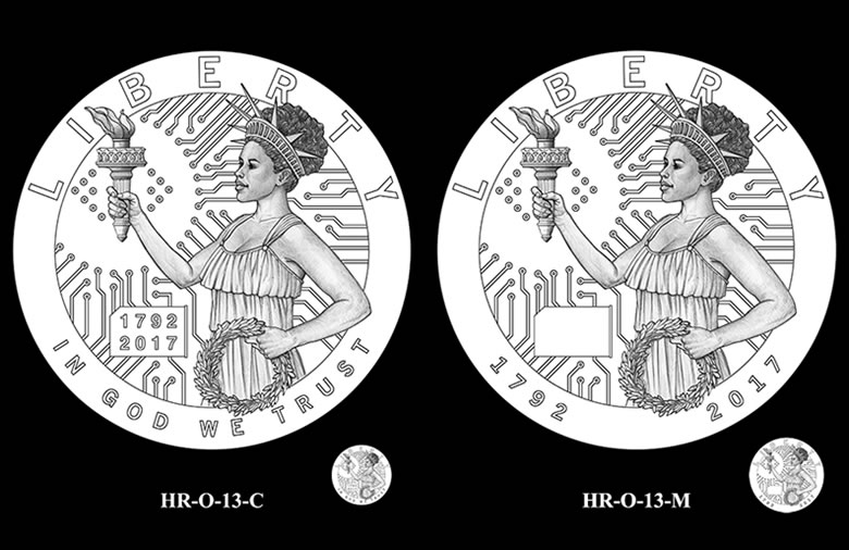
HR-O-13 depicts Liberty in the Digital Age. The artist uses the elements of a torch, a wreath, and a circuit board to symbolize the light of Liberty spread throughout the world through the Internet. In the circuit board element, the circuit connections, or circles, number a total of 50, with 13 of them around the Torch, denoting the 50 states and original 13 colonies.
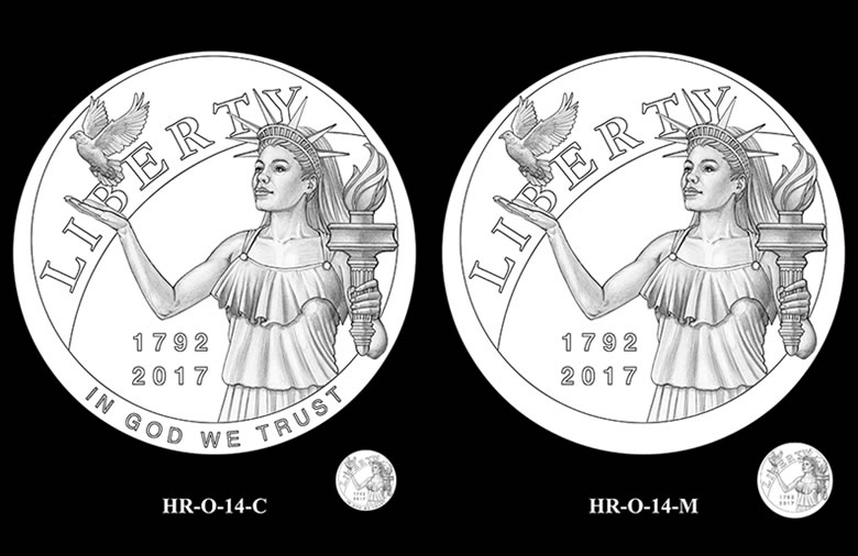
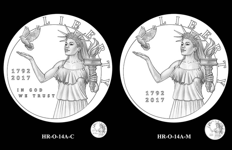
HR-O-14 and HR-O-14A show Liberty releasing a dove, freeing the symbolic bird to spread peace. In her left hand she holds her torch. In HR-O-14, the portion of the circle shown behind Liberty represents a spherical shape, such as the Sun, while HR-O-14A offers a version without it.
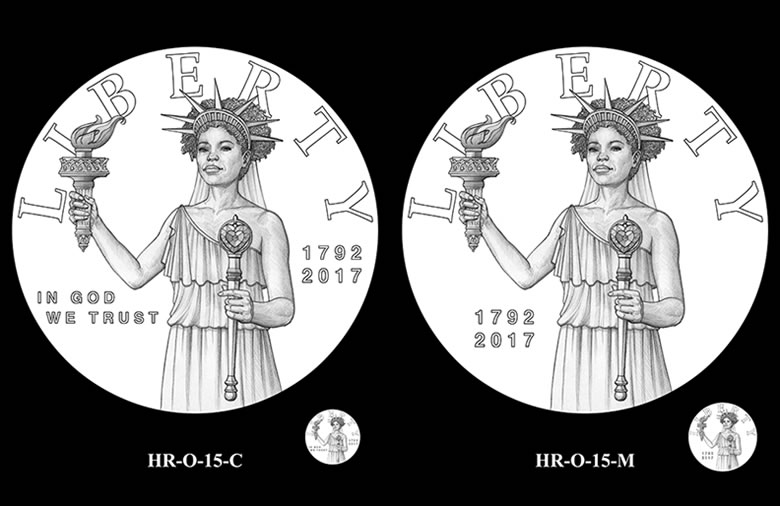
HR-O-15 shows Liberty holding a scepter that is topped by a heart-shaped jewel. Here, the artist’s imagery is a reminder that Liberty does not grant us license to do whatever we want. Rather, Liberty grants us the freedom to rule our own hearts and govern our own passions.

HR-O-16 features Liberty holding her torch with her right hand, while her left hand holds scales. The artist uses a heart-shaped jewel representing passions, and a book symbolic of both knowledge and the law to suggest that these elements in balance lead to the fullest expression of Liberty.
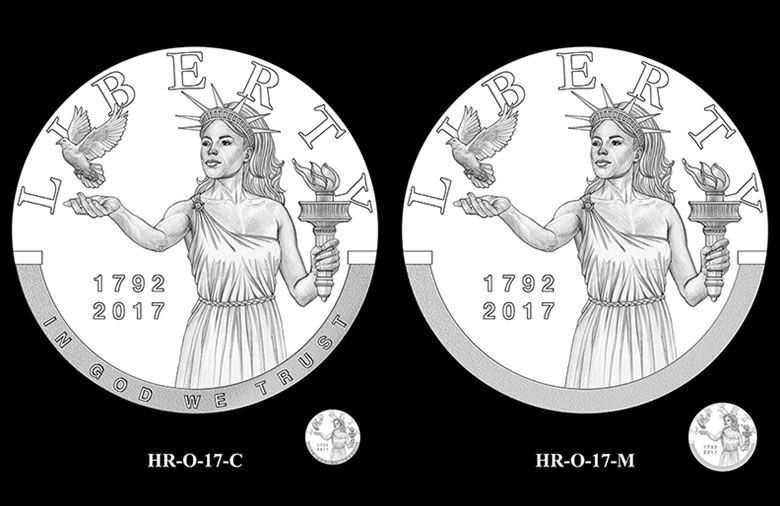
HR-O-17 places Liberty at the scooped opening of a garden wall, releasing a dove in a symbolic gesture of freedom and peace. Her left hand holds her torch.
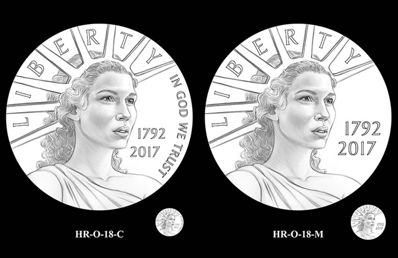
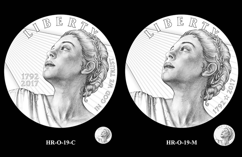
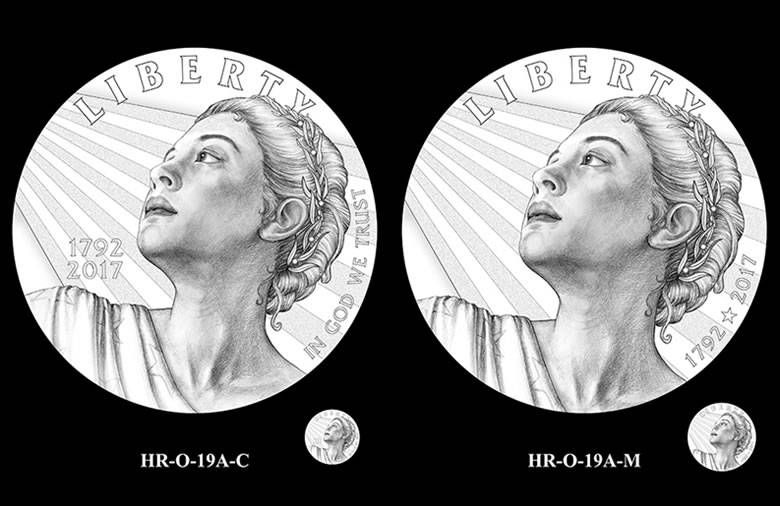
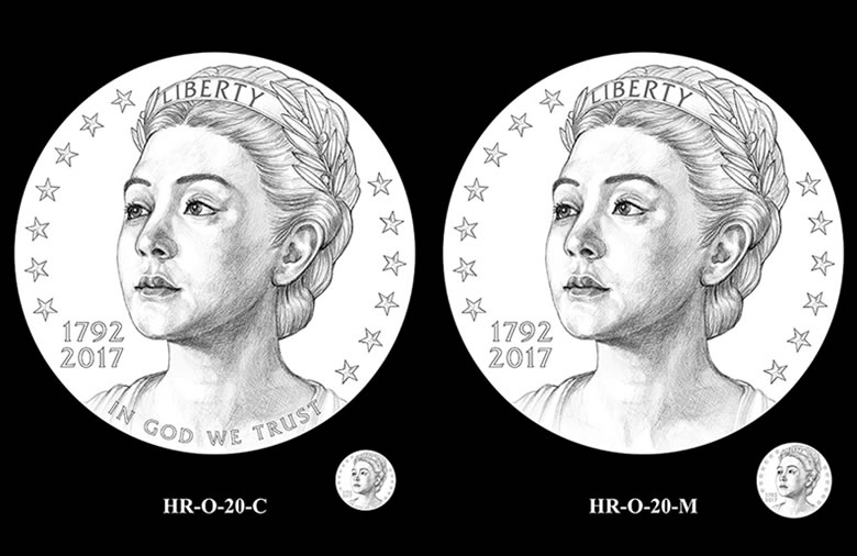
HR-O-18 through HR-O-20 depict close-up visions of Liberty as she gazes towards the new millennium. In HR-O-19, fine rays of light emanate from the left, while in HR-O-19A the rays appear as thirteen stripes, a compliment to the stars on the American flag draped over her shoulder.
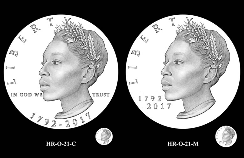
HR-O-21, shows Liberty wearing a wreath of wheat and olive, signifying peace and abundance. The unripe olives suggest the promise of growth to yield an even greater harvest.
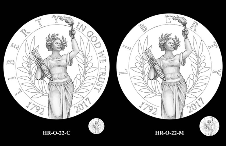
HR-O-22 depicts a standing Liberty, a torch in her left hand and a fasces in her right. The crown of wheat signifies abundance, while the silhouetted olive wreath in the background represents peace.
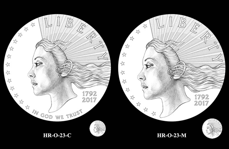
HR-O-23 features Liberty, with thirteen rays of light, symbolizing the free and creative spirit of America’s people, emanating along a headdress.
Design Candidates for Reverses
Required inscriptions for the gold coin are "United States of America," "E Pluribus Unum," "1 oz.," ".9999 Fine Gold," and the denomination, "$100." The corresponding silver medal may optionally depict the inscription "United States of America."
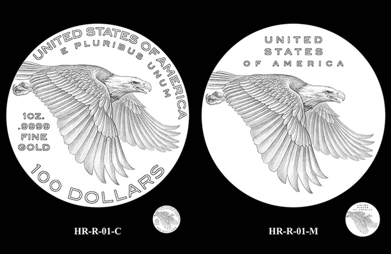
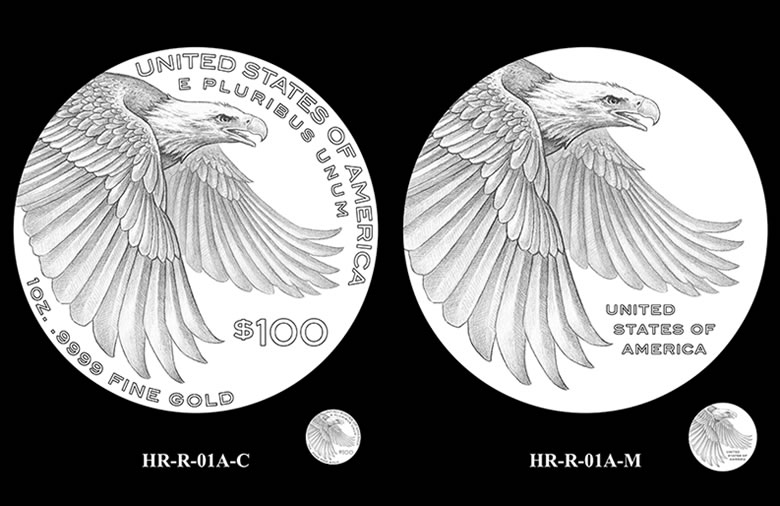
HR-R-01 and HR-R-01A depict a bold and powerful eagle in flight, with eyes toward opportunity and a determination to attain it.
Update: Both the Commission of Fine Arts and the Citizens Coinage Advisory Committee recommended HR-R-01-C/M for the coin and medal reverses.
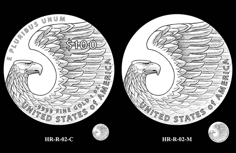
HR-R-02 features a stylized eagle displaying its feathered wing in powerful gesture.
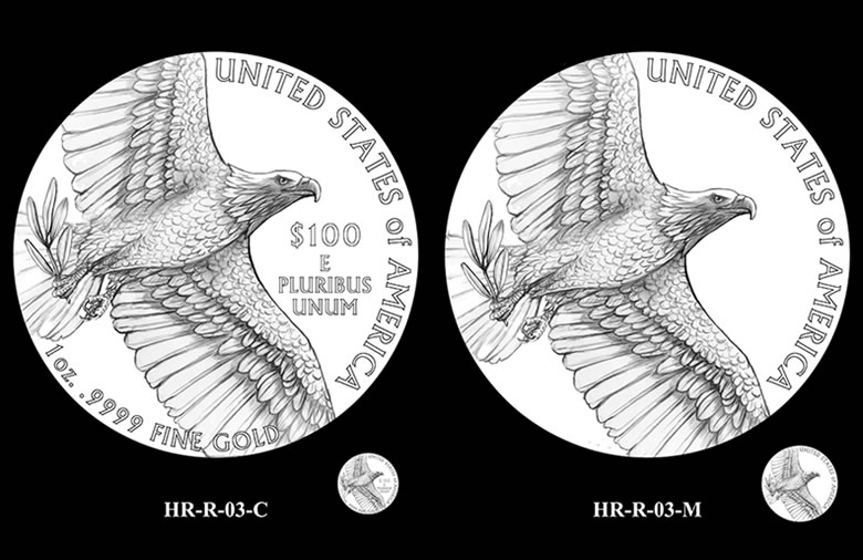
HR-R-03 places the viewer below an eagle in flight, catching a glimpse of the olive branch it clutches.
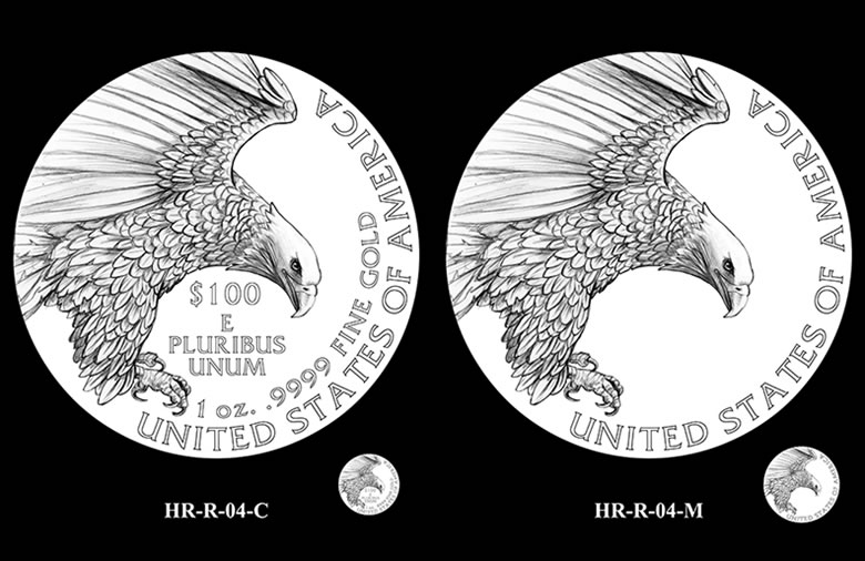
HR-R-04 depicts an eagle as it prepares to land.
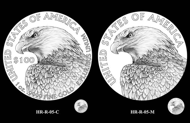
HR-R-05 shows a close-up view of an eagle, emphasizing its powerful form as it looks to the left.
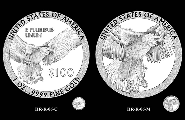
HR-R-06 displays an eagle with wings fully opened, a symbolic show of the strength that secures freedom.
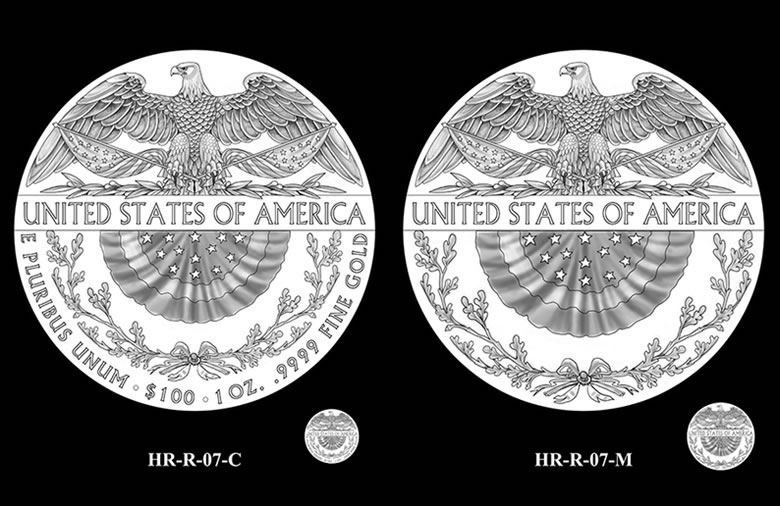
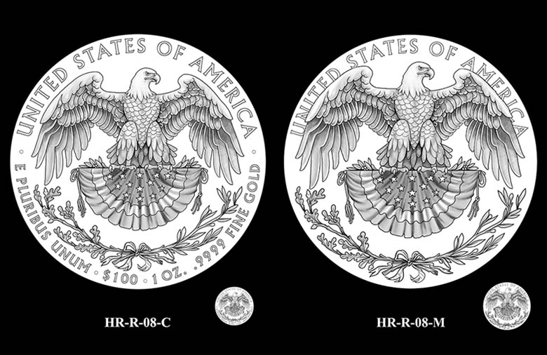
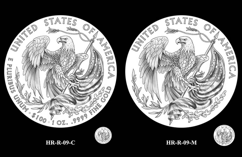
HR-R-07 through HR-R-09 feature heraldic eagles, displayed with banners, and branches of oak and olive. In HR-R-07 and HR-R-09 the eagle clutches an American flag.
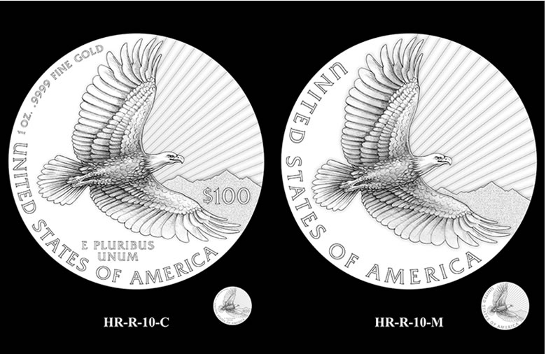
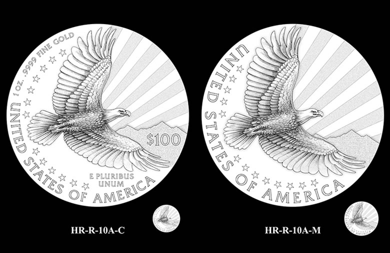
HR-R-10 and HR-R-10A feature and eagle in flight, while rays of light rise from behind a mountain range. The fine rays depicted in HR-R-10, are replaced in HR-R-10A by rays appearing as thirteen stripes, complimenting the thirteen stars displayed.
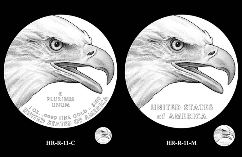
HR-R-11 presents a close-up view an eagle.
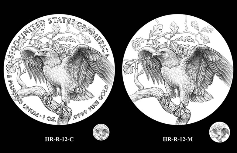
HR-R-12 shows an eagle poised on the limb of a bur oak, with wings partly outstretched and its head in profile view. Behind the eagle, a branch of the oak curves into the distance.


12 and 7
A lot of the others look like prom queen or Miss America wannabes
I tend to choose more classical depictions where portraying Lady Liberty is concerned – the more allegorical in approach, the better and in this regard, I’d choose design 11 for the obverse, no rays, no stars, just a classical depiction I think would show up wonderfully in high relief and for the reverse, also a more classical design of an outstretched eagle along with a representation of the flag and branches below, I’d choose design 8
Let’s see if other readers think in similar terms – will eagerly anticipate the results and final products..!
Oh Boy! I could write a book about how bad these designs are along with the obvious political correctness theme emanating so in your face.
That said, I could find a few good reverse images. I think the Obverse should merely have the dates and the word Liberty along with In God We Trust (as the image). That’s it.
This will not be a big seller with these choices… thus possibly making this a very collectible coin in the end with low sales. Just a thought.
All opinions are welcome….
I’m out of the business of buying high dollar coins just for the Reverse.
So much for the series…
Don’t know how this series got started, don’t care. Didn’t like the anorexic Liberty of 2015 and don’t like these choices either. I’m glad they made the bad choice for 2015 so I didn’t get enthused about the series. Don’t understand how they managed to sell 49,000+. Saving money by not subscribing to this series.
Thank-you for a great article ..the reverses are interesting but the rest is crap..TR must be rolling over in his grave
I guess we really are the melting pot. Talk about being politically correct. The images of Liberty are awful. Isn’t that a little bit of reverse racism? Just a thought.
Millhouse
12 with 9 reverse would be very striking!
12 and 7 seem to be one of the only good combos out of this batch.
Anyone know what the CCAC recommended?
Minutes ago, the CCAC recommended the obverse design HR-O-08 and the reverse design HR-R-01.
Interesting designs to say the least.
HR-R-01 looks like the eagle is being chased & looking for the nearest airport to land!
HR-O-12 looks like Lady Liberty did a complete harvest by herself & is looking for someone to sell it too!
HR-O-02 looks like my favorite talk show host Wendy Williams saying “How You Doing?”
The Treasury Secretary will get a migraine trying to pick the final designs. Good luck!
-NumisDudeTX
What is the CCAC smoking? The good news is I will save a good chunk of money passing on this garbage!
I can’t believe the choices the CCAC made! Actually I do believe those POOR choices. Seems to be the norm now. I’m telling you all, this could be a buying opportunity. It’s going to be a stinker from the comments received here.
HR-O-20 looks like Hillary.
HR-O-19 looks like the late famous dancer Martha Graham!
HR-O-20 looks like a young actress/swimmer Ethel Merman!
-NumisDudeTX
I meant Esther Williams! Wrong celebrity. Lol
WOW! “More classical”, “politically correct”, “political correctness”, “reverse racism” & “in your face.” Oh and of course “interesting”. What was it they wanted in this design? Did they ask for LADY LIBERTY to look more like this? It would be interesting to know what was asked for. What “word” did they use, “BLACK” or “AFRICAN AMERICAN”?? I mean it is sooo obvious!!!
I can’t believe I just asked that in a coin forum. Nothing is free from the “race” topic anymore.
joera: exactly!
Some reverses are outstanding, but don’t like a single obverse. Something’s missing.
I don’t mind the racial diversity presented; I’m not really sure why anyone has a problem with that, considering there are still plenty of white options. It can’t be counted as reverse racism (which isn’t really a term, by the way, still just called racism) to have a representation of prominent U.S. ethnicities. Still not a fan of these obverse designs though, that being said. They all look like Disney princesses. The design should be more classical; a better representation of Liberty and her embodiments. Love some of the reverses though (01, 02, 04, 09). Very strong designs. However, the… Read more »
I am in favor of diversity, but this is not diversity, they are all the same in an obvious way. Last year HR also had a Mrs. POTUS look to it. Will’17 have the latina, the ’18 the asian, the ’20 the arab/muslim in hajib the ’21 the Jewess? Ridiculous, who is the subject audience that only wants a 1 style subject for all coins now? Heck I am a minority but this is so over the top….politix hitting the coin worl full on, Nixon looks like a con, Reagan a clown, to be fair Jonson is like the old… Read more »
Perhaps these coins are supposed to make up for the supposed lack of diversity in Oscars – “And the Academy award goes to…!” hee..hee..! At first, I actually thought these coins were commissioned from Liberia – honestly.
Hr-r-04… Awesome
I just want to say I am so sick and tired of racist comments from coin collectors! People need to get used to the fact that America is diverse. The incredible irony of this country is that it was founded on precepts of liberty and freedom, while the slave trade was thriving. We’ve finally come so far in walking the talk so to speak; meaning we (i.e., some of us) are finally starting to behave in a way that is consistent with these founding principles, and honoring the fact that our society is made up of people of all racial/ethnic… Read more »
Whistler-Now that was some funny stuff!. LMAO!
Brian, this is all in good fun. These designs are pretty obvious. Not that there is anything wrong with that. (Seinfeld).
Jp –
Too funny dude! Where are my LGBT brothers/sisters in this politically correct numismatic coin/medal design debate. There, I came out as a Gay numismatist! (“Not that there is anything wrong with that”) (Seinfeld)
-NumisDudeTX
HR-04 Princess Lea ?
JP, mahalo & 07 is Venus Williams @ Olympics post winning the gold medal!!
Whistler –
Princess Lea! LOL Right on target. “May the Schwartz be with you.” (Spaceballs)
-NumisDudeTX
Ok that’s it all. I have used up my last Attends reading these enlightening comments. We can all agree it seems that this just wasn’t the Mints best work.
Oh that poor girl on 18 looks so distressed with those spikes coming out of her head. I just can’t get that image out of my mind…
HR-O-08 –
“Mommie, you better wear that stars crown I made in preschool to work tomorrow!”
-NumisDudeTX
OH MY GOD!!! RACIST??? WELL!! I NEVER!!! LOL I guess I’m racist. But I don’t know who or whom to or what color, skin, hair, eyes or (to go a little bit further, if I dare) language, accent or dialects, I am a racist to or towards. I’m a half breed. And so are my brothers and sisters. You should hear us at a family reunion. “YOU” would not be able to stand it. We notice the obvious and labeled racist?? If you can not laugh at yourself then you should not laugh at all. Is that how that goes?… Read more »
For ideas, I think the Mint should look into actual Statue of Liberty design and in particular her face. I’ll be fine with platinum coin similarities.
I like HR-0-21 Reminds me of Queen Nefertiti
Ozzie –
You must be thinking of Queen Latifah!
I have seen the original ancient bust of Queen Nefertiti at the Egyptian Museum in Berlin, Germany where it resides when I was a student there in the late 1970s. It is an amazing ancient artifact to behold & she must have been a beauty & very powerful considering the large, ornate headdress she is wearing.
-NumisDudeTX
If I’m not mistaken, the CFA met to discuss the above designs, anyone have insight to their recommendation?
Thanks in advance!
@Brian- we have the first amendment so it is not a crime if someone has racist views and I doubt the commenters here are?. If it bothers you your welcome to go elsewhere. Nothing worse than a malcontent complainer.
Barry, I agree with you all the way and thank you for posting that. My family comes in as many colors and back grounds as a box of Crayons. I showed this article and comments to some of my family. They were not bothered by any of the comments and in fact were entertained by them. And some relatives, including blacks, did not like the coins or the choices of the Mint. They thought they were a design for another country and not “Lady Liberty” or a symbol of America, AT ALL!! In fact they thought the classic look of… Read more »
@joera- Thank you for the support. Peoples personal preferences were being questioned and they were being branded imo. So let’s say most would agree that Whitney Houston or Donna Summer was better looking than Oprah or Tiger Woods ex wife looks better than Rosie Odonnell .So if someone doesn’t like a Oprah or Rosie coin then something is wrong with them? No, it is personal preference. If someone said Rosie looked better than Whitney I would say they have other issues going on. I think the coin designers are boxed in by PC and aren’t free to design outside certain… Read more »
Joe March 15, 2016 at 7:44 pm
HR-O-20 looks like Hillary
JOE, Hillary never looked that good in her life.
ken:-
Maybe with a facelift.
I like HR-0-07-M////// HR-O-07 finds Liberty wearing a Phrygian cap and a gown adorned with stars. She holds the American flag in her left hand. That is the design I like and I am going to email the mint saying so!
6, 12 or 18, the others look cheap and junky
For the reverse, 01A and 09…the rest…I mean, these designs, front and back are some of the worst, most uninspiring, lazily drawn designs I have ever seen for our nation’s currency…they are seriously pathetic. The designs of our currency both paper and coin from 1792-1947 is what is good, for the most part -the designs were well-drawn works of art, they were intentionally good amd communicated something good. Most of these “drawings” look like a tired depiction of an uninspiring woman and a pathetic weak wimpy eagle, not all reflective of what the definition of Liberty is as determined by… Read more »
And, Brian, as others pointed out, we all have the freedom of speech as guaranteed by God in the 1st Amendment to the US Constitution; don’t pull the race card when someone doesn’t like the same picture you like, it’s tired, cliche and poor taste. Getting upset because someone isn’t thrilled with a depiction of an American woman whose skin happens to be dark is exactly what perpetuates racism – it is an obvious agenda of the current president to present all these images to us. Why should the minority opinion rule? If the roles were reversed and people of… Read more »
I believe this coin will not have sells at big numbers. If that is the case then they will be very low mintages which could add value to them. But low mintages is not the only factor in value. There has to be a big demand for the coin or any collectable for that matter. I’m still on the fence on whether to buy this coin or not.
Yeah, just take a look at the spouse series – how low their mintages are and how nobody wants them either.
Looks like an interesting line up. I might have to start my collection!